In our last blog post, we shared an approach that may help you get started with making simple, interactive web maps with your tabular data. We used an example from a recent project (mapping member locations for the Major Cities Chiefs), but this process could be applied to any similar data table common in the Public Safety arena – think crime incidents, patrol posts, or critical facilities.
Once your data has been added to the map using the methods we described in Part 1, it’s time to start styling your map-deciding on the ‘look and feel’ that end users will experience can go a long way to making an interactive web map useful!
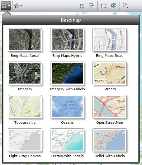
First, you may have noticed that when you brought in your tabular data, your points were laid on top of an existing map. Having a nice, detailed basemap already prepared is a real time saver and is a key first step towards a great-looking web map. ArcGIS Online provides several different basemaps for you to choose from, so a simple way to customize your project is to explore the different options. Just last month Esri added a new option, the light gray Canvas Map, which can be particularly effective when you want your data to take center stage, and the basemap to provide subtle context. Changing between basemaps is easy-use the ‘Basemap’ button to view the gallery, and
click on any of the thumbnails:
After selecting a basemap, explore it by zooming in, out, and around your map; the appearance changes at different scales, so it’s important to see which may be the best fit. Here are some examples of how our data would look when overlaid on different basemaps. Note how some basemaps highlight the point data, while others provide more layers of information:
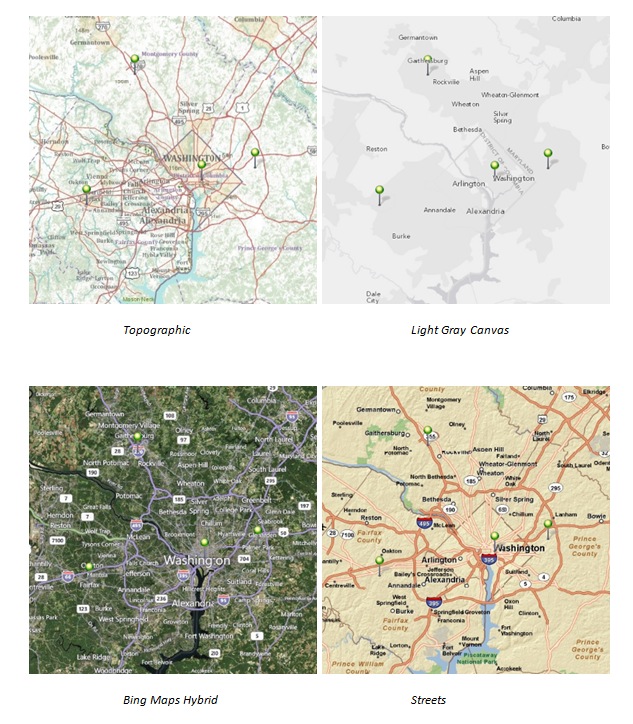
For this project, I chose the light gray canvas map:
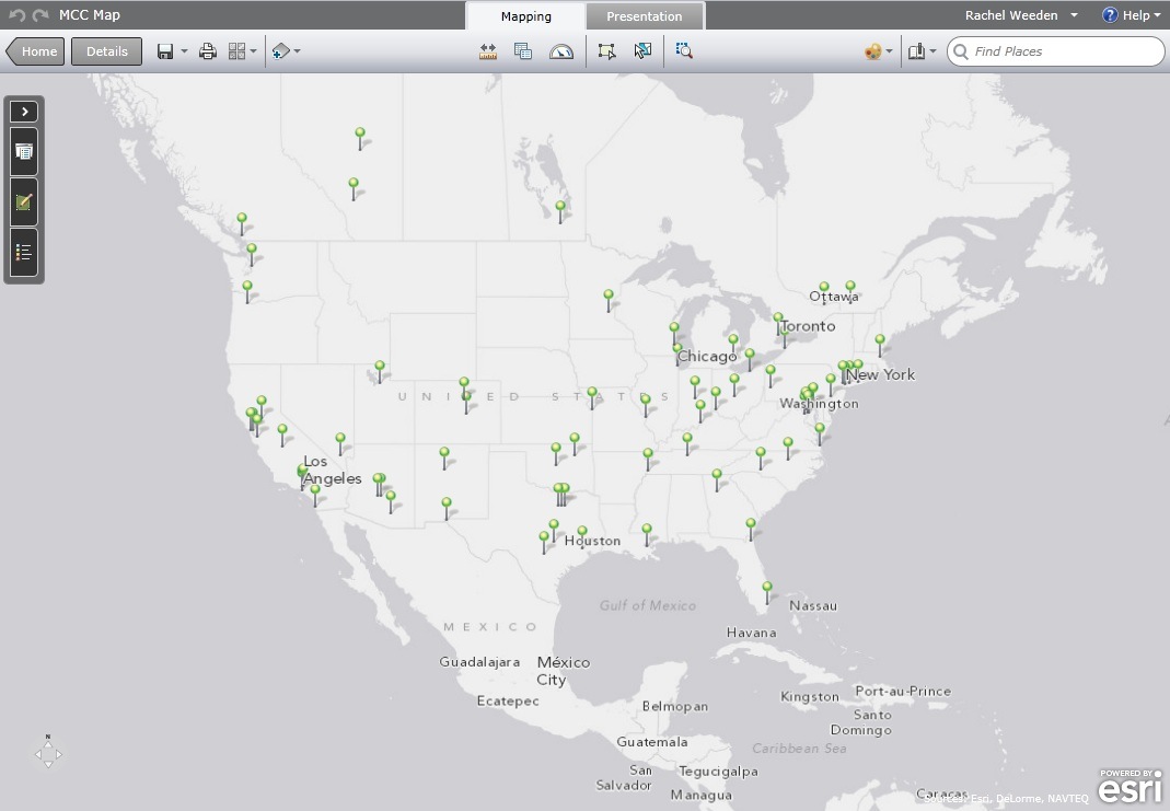
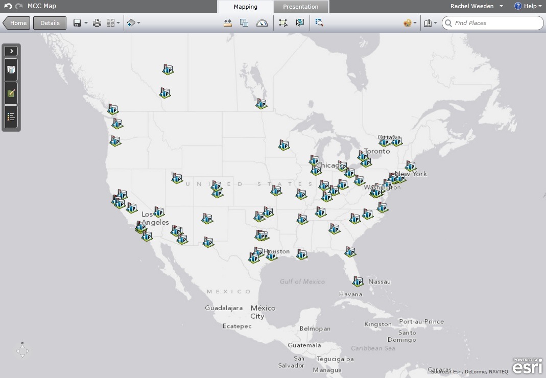
With a basemap selected, we can now focus on the data that you’ve brought into your map. We’ll call this the ‘operational layer’-it’s your organization’s business data, the star of the show. The default symbol, green stickpin, might be the exact way you wanted to represent your data. Assuming you had something else in mind, let’s take a look at the different ways you could change the look of your point data. By default, all of the features in your layer (all of the rows of your spreadsheet) are drawn with the same symbol. In this case, all of the police departments look the same on the map. If we change the symbol for one feature, they will all change. I’d rather use a symbol that is more appropriate for law enforcement, so I’ll change the style of my symbol to one from the ‘Safety Health’ category:
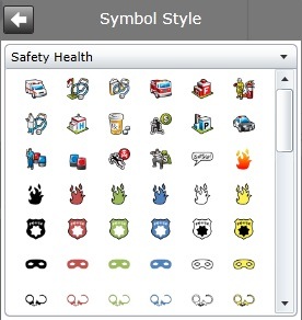
I chose the Police Station symbol, and also adjusted the size to 18 point, a bit smaller than default:
If you wanted to go further to represent your data in an intuitive way, or communicate a specific message that needs more visual impact, there are options to change the symbols based on information in the table. For example, if we wanted to make the icons on the map reflect the total budget of these police departments, we could use the field ‘Budget’ from our original spreadsheet. Because this field was a part of the spreadsheet that we uploaded to the site, it’s available to help us style our map. In this case, we can choose to draw features classified by value. In other words, the appearance of the symbol will reflect the value of a field we choose. This works with any numerical field. Instead of using the default of ‘Single Symbol’ I’ll choose ‘Classify Using Size’ from the Configure Display panel:
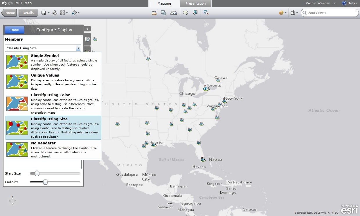
You can see the change in the symbol appearance on the map, above. Police departments with larger budgets now have a larger symbol and vice versa. Be sure to note that any blank or missing values in the spreadsheet will affect the end result—police departments that had no budget value listed do not show up on the map. Again, exploring the different ways to style your data is easy and it’s difficult to make a mistake. Try a few different options to see what works best. When you are done experimenting and find something you like, save your map.
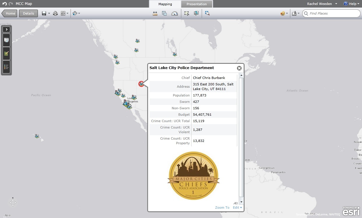
Now that our map is styled with an appropriate basemap and meaningful symbology for your data, let’s add another dimension. The first thing that most people will do when they see your map is click on one of those points. It’s a way for them to ask ‘What is this?’ Doing so will show more information about the point in a pop-up window. One way to create a useful web map is to make sure that when someone clicks on a point, the information that’s displayed is clear and meaningful. We saw in the previous post that, by default, the pop-up window shows all of the data that was in your spreadsheet. Chances are you’ll want to make a few changes, whether it is changing the field name or turning off some data.
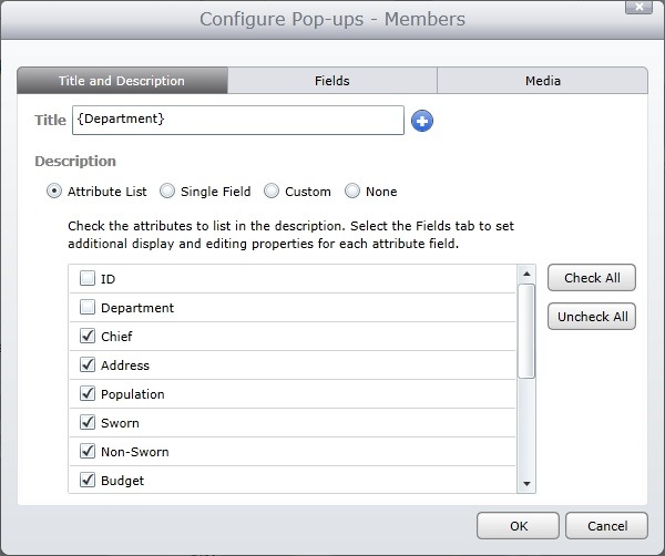
In this case, I’ll access the Configure Pop-ups menu and do some formatting of the fields. First, instead of plain text, I can select one of the fields to be the heading in the pop-up window—a good choice would be {Department}, so right away users see the name of the police department they’ve clicked. Note the curly brackets that designate you’re using a field value rather than plain text. In other words, typing ‘Department’ is not the same as typing ‘{Department}.’ ince I am using that field as the title, I can turn it off from the field list along with other fields I don’t need to see:
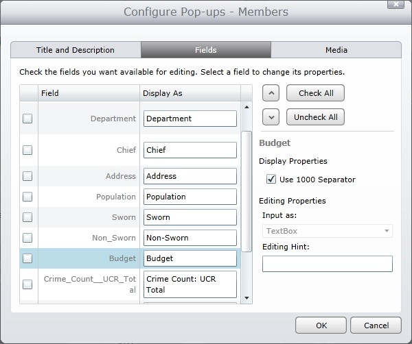
There are more pop up window properties you can change on the ‘Fields’ tab, such as formatting numeric fields to use comma separators. What’s important on this tab is that you can control which fields you want your map users to be able to edit or change. In this case, I don’t want any changes to be made, so I’ll uncheck all the fields as
editable:
In addition to editing the way your tabular data appears in the pop-up, you can also add multimedia content that might not have been a part of your original dataset. This could include photos or videos. With the sample data we’ve been using, I may want the Major Cities Chiefs logo to appear in each pop-up. It’s important to note that, in order to add an image, it must already exist on the web -this is different than uploading an image file from your computer. If you have an image you’d like to use that is not available on the web, you may be able to talk with your IT/web department to see if they can help you host the image. In this example, I am using the Major Cities Chiefs logo that is posted as an image on their Facebook page:
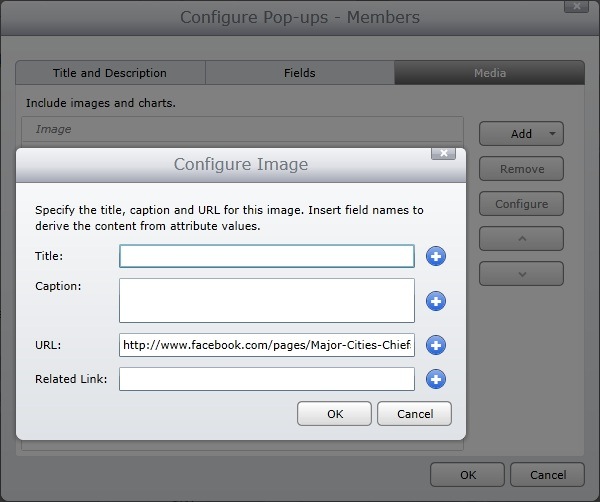
Entering a title, caption, or related link for the image are optional fields. I left them blank to let the logo speak for itself. Here’s what the pop-up window looks like, as a result:
At this point, I’ve done three simple things to style my map: I’ve selected a basemap, changed the symbols of the point data, and configured my pop-ups. Not only do you have a great-looking web map, but you also provide useful, contextual information to users who interact with it. Now, we just want to get it into the hands of people who need it! There are lots of different options in ArcGIS Online for sharing our web maps and giving people access, which is what we’ll discuss in the next blog, “Getting Started with ArcGIS Online Part III: Sharing Your Map.”
Contributed by Rachel Weeden, Solution Engineer Manager, and Paul Doherty, Public Safety Technology Specialist